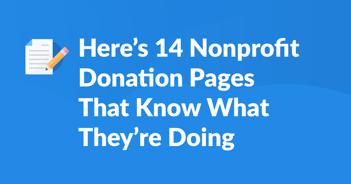
Here’s 14 Nonprofit Donation Pages That Know What They’re Doing
Nonprofits around the world are always striving for new and exciting ways to engage with potential donors. You need to launch your campaign, test your email deliverability, craft your message, and more. But one of the easiest things you can check off your to-do list is perfecting your donation page.
The reality is, an organization’s donation page is often its own greatest enemy. The good news? There are plenty of best practices that, if implemented, make it pretty straightforward to improve conversion rates and ultimately raise more money.
So test out new ideas, seek inspiration, and embrace the quirks! Below, we chronicle 14 donation pages, providing takeaways from each one, so you can apply some of these strategies to your own fundraising campaigns. These pages range from complexly designed to efficiently simple, but they all have some key similarities: they’re secure, accessible, filled to the brim with best practices, and feature EveryAction’s best-in-class donation forms.
Catholic Relief Services
Catholic Relief Services gets a shout-out for their clean and crisp page design. But the high marks don’t end there. This page has a prominent monthly-giving option, encouraging donors to give at regular intervals. Scroll further down and their footer is filled with credentials from CharityWatch, give.org, and Charity Navigator, indicating to donors that their information will be encrypted and kept safe. Way to go CRS for establishing your credibility and building trust with future donors!
United States Holocaust Memorial Museum
The U.S. Holocaust Memorial Museum has a clean and effective donation page and does something incredibly powerful—it tells a story. Next to each donation amount is a brief description of how and where your donation will make an impact. By building that level of trust with your donors, you’re reinforcing their confidence in donating and building a lasting connection. Why not tell your story in your donation forms?
Audubon Society
A picture is worth a thousand words—just ask the Audubon Society. Their donation page features a beautiful image, accompanied by text that points out why a potential donor should support their organization and how it will impact their cause. Bonus points for the green lockbox located at the bottom of the form. While it may seem inconsequential, potential donors are concerned with the risk of fraud, so by ensuring them your forms are secure, that’s just one less obstacle between you and those donor dollars.
Healthier Colorado
Fact: We love Healthier Colorado’s donation page. From their logo at the top to the textured background to the visually appealing color scheme, Healthier Colorado makes you want to donate just by looking at their page. Small details like a simple check box for transforming one-time donations into a monthly gift, take this donation page from good to great.
Union of Concerned Scientists
Looking to create an impact with the copy on your donation page? Look no further than the Union of Concerned Scientists. This may be the simplest design on our list but sometimes the simpler the better. This donation form doesn’t mess around from its call-to-action at the top to the text that creates a sense of urgency with the viewer.
World Central Kitchen
World Central Kitchen’s donation page focuses on topical issues. In this case, they’re directly relating the work they do to the immediate need for relief efforts in Puerto Rico. Presenting donors with a clear value proposition, increases the likelihood they will follow through. Pairing images with actionable, value-driven copy, World Central Kitchen is determined to remind donors why they should donate in the first place.
Alliance for Youth Action
Alliance for Youth Action’s colorful page makes it impossible to leave without wanting to donate. From the bright color scheme to the punny tagline, this page is the perfect example of blending a bit of humor with perfectly executed design for a great donation page.
Fresh Truck
Fresh Truck’s donation form captures the attention of the audience with their visual donation buttons. Each donation button has a corresponding image and action that allows the donor not only to read about what their money will support, but to see it. This is a powerful and innovative tool to tell your story and attract new donors.
Reproductive Health Access Project
Reproductive Health Access Project has a beautiful donation page that combines several best practices. A one-click checkbox to convert one-time donations into monthly gifts? Check. Succinct copy demonstrating the organization’s mission and the impact a donor can make? Check. Easy to use form? Check, check, check. We also love that donors have the option to make a contribution in memory of someone. Adding these small personal touches can make a world of a difference in your forms.
The Blue Green Alliance
The Blue Green Alliance shows how you can create a no frills donation page while still making an impact. Their copy creates a sense of urgency while also explaining the importance of their cause. Other small but significant touches include the addition of a support phone number and a call-to-action for “More Ways to Give” to keep donors involved beyond just the donation.
People United for Justice
This donation page gets straight to the point. No long copy, no navigation bar, just a beautiful image and the donation box. If you find that your donation page has a high bounce rate, consider this strategy to keep your future donors from getting distracted. How can you leave a page as stunning as this?
Protect Our Winters
Protect Our Winter’s donation page is the perfect example of a form that uses a multi-step process. This helps break up the donation process into easier to manage chunks rather than presenting all the information at once. By just clicking a few buttons the user can have an easy and effective donation experience without all the unnecessary scrolling.
Greenpower
Greenpower has a beautifully designed donation page with a succinct call-to-action and a brief explanation on why to donate. With FastAction, users can seamlessly create a login, store their contact information and payment preferences, and enjoy one-click donations not only on Greenpower’s forms but across the entire EveryAction network.
Hole Food Rescue
It’s no secret, a well-designed, branded donation page has a lasting impact on donor behavior. This is especially true of Hole Food Rescue, adding a personal touch on their donation pages with a copy of a handwritten note. This is a creative way to show potential donors the impact of their donation beyond just numbers and statistics.
There you have it—the hottest donation pages on the block. We’re proud to power these—and thousands of other—nonprofits every day. Do you have a favorite that we should know about? Let us know!
Interested in learning more about how EveryAction can help you crush your fundraising goals? Click here to learn about our tools